Industry:

Renewable Energy / Clean Technology

Greenleaf Africa

A complete brand identity system for a renewable energy company built around reliability, engineering and sustainable innovation.


Summary

A complete brand identity system for a renewable energy company built around reliability, engineering and sustainable innovation.

Project Overview

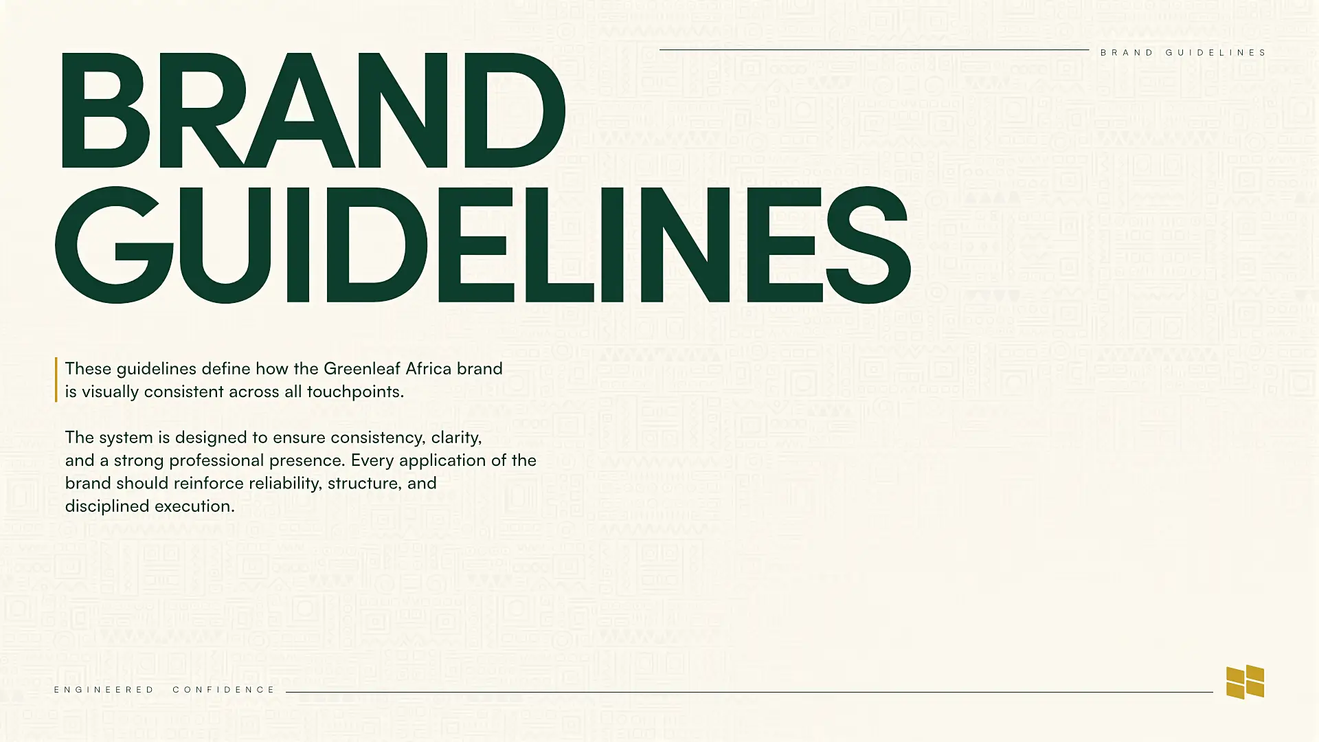
I designed the complete brand identity for Greenleaf Africa, developing a visual system that communicates reliability, engineering discipline and renewable energy innovation. The project went beyond the logo to establish a practical identity system covering colour, typography, graphic elements, layout, photography and brand applications. The identity was designed to work consistently across both digital and physical touchpoints, from websites and social media to stationery, signage, vehicles and apparel.

Case Study

Greenleaf Africa is a renewable energy brand, and the identity needed to communicate more than sustainability. It needed to feel engineered, dependable and professional while still reflecting the optimism and potential of renewable energy.

I started with the logo, creating a modular mark inspired by solar panel structures and engineered energy distribution. The geometric construction gives the symbol a strong sense of order and precision, while its modular nature makes it easy to recognise and reproduce across different sizes and applications. The brand guideline describes this idea through the principles of structured implementation, scalable systems and controlled energy distribution.

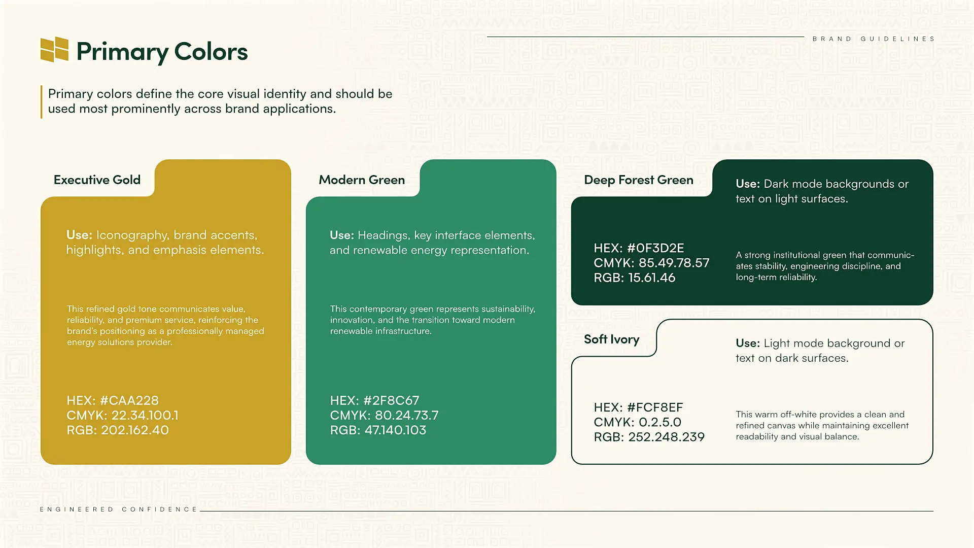
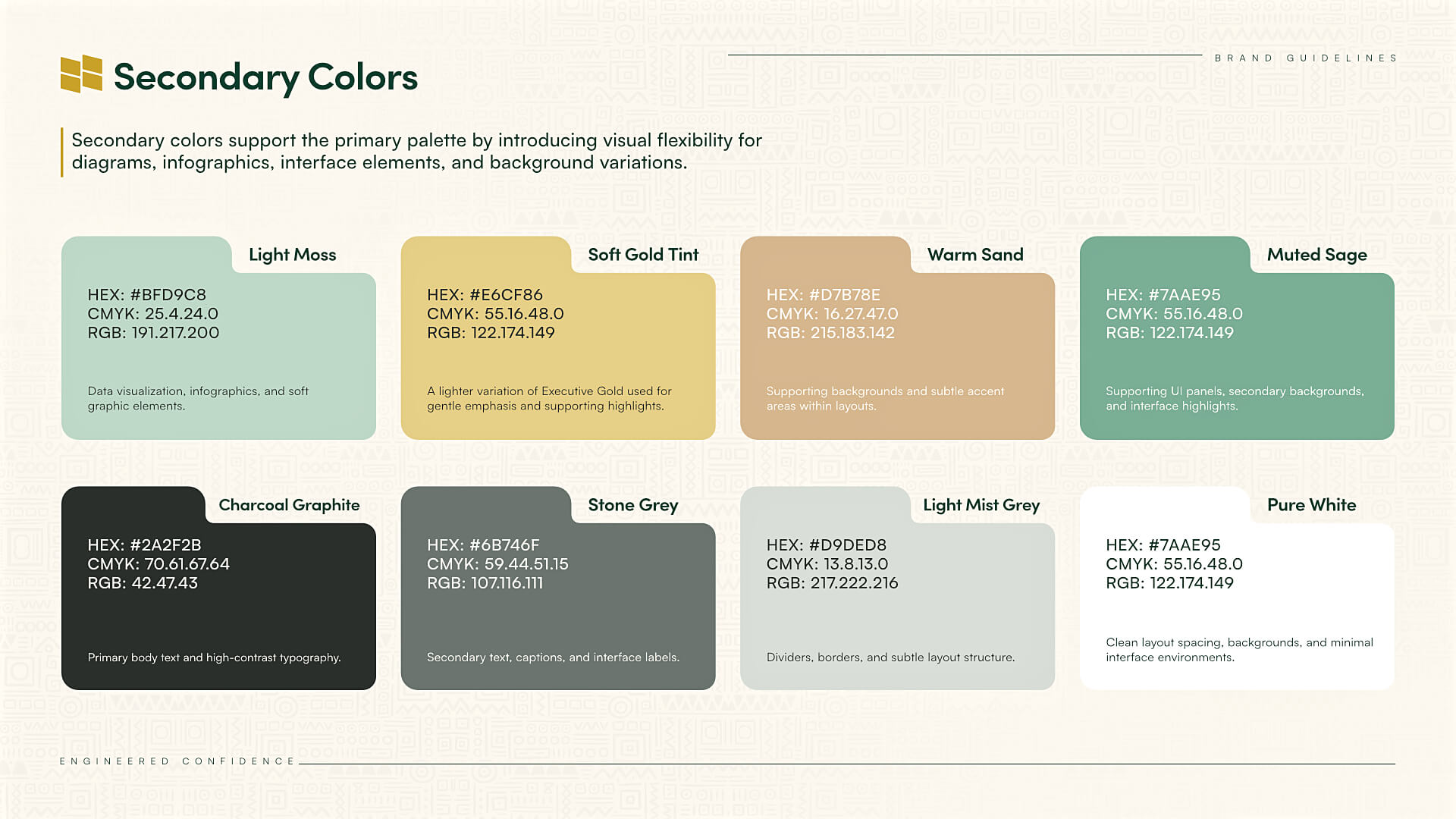
From the logo, I developed the wider visual identity around the idea of “Engineered Confidence.” The colour palette combines Executive Gold for energy, emphasis and innovation with Modern Green and Deep Forest Green to communicate sustainability, reliability and long-term confidence. A soft ivory provides a clean foundation for the system.

Typography was designed to reinforce the same balance of confidence and clarity. I paired Sofia Pro for headlines with Satoshi Variable for body copy, creating a system that feels modern, structured and highly readable across different applications.

I also developed the supporting visual system, including a geometric African-inspired pattern, structured layout principles and a photography direction centred around real-world renewable energy environments such as solar installations, infrastructure and modern energy systems.

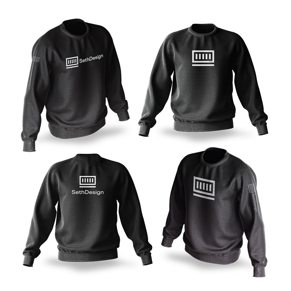
The identity was then tested across real-world applications including office signage, stationery, vehicle branding, uniforms, hoodies, T-shirts, caps, mobile interfaces and digital screens. This helped ensure that the system wasn't simply attractive in a brand presentation but remained consistent and recognisable wherever the brand appeared.

The final result is a complete visual identity built to make Greenleaf Africa feel credible, modern and technically capable, while still connecting the company to Africa's growing renewable energy landscape.

Greenleaf Africa is a renewable energy brand, and the identity needed to communicate more than sustainability. It needed to feel engineered, dependable and professional while still reflecting the optimism and potential of renewable energy.

I started with the logo, creating a modular mark inspired by solar panel structures and engineered energy distribution. The geometric construction gives the symbol a strong sense of order and precision, while its modular nature makes it easy to recognise and reproduce across different sizes and applications. The brand guideline describes this idea through the principles of structured implementation, scalable systems and controlled energy distribution.

From the logo, I developed the wider visual identity around the idea of “Engineered Confidence.” The colour palette combines Executive Gold for energy, emphasis and innovation with Modern Green and Deep Forest Green to communicate sustainability, reliability and long-term confidence. A soft ivory provides a clean foundation for the system.

Typography was designed to reinforce the same balance of confidence and clarity. I paired Sofia Pro for headlines with Satoshi Variable for body copy, creating a system that feels modern, structured and highly readable across different applications.

I also developed the supporting visual system, including a geometric African-inspired pattern, structured layout principles and a photography direction centred around real-world renewable energy environments such as solar installations, infrastructure and modern energy systems.

The identity was then tested across real-world applications including office signage, stationery, vehicle branding, uniforms, hoodies, T-shirts, caps, mobile interfaces and digital screens. This helped ensure that the system wasn't simply attractive in a brand presentation but remained consistent and recognisable wherever the brand appeared.

The final result is a complete visual identity built to make Greenleaf Africa feel credible, modern and technically capable, while still connecting the company to Africa's growing renewable energy landscape.

Client:

Greenleaf Africa

Location:

Africa

Category:

Brand Identity, Logo Design, Visual Identity, Art Direction

Services:

Logo Design, Brand Identity, Visual Direction, Typography, Colour System, Graphic System, Brand Guidelines, Brand Applications

Start Date:

Duration:

1 Month
  • MORE WORK

    MORE WORK

    MORE WORK

Official Communication: We only communicate via email addresses ending in @setheneh.com and @setheneh on Instagram and X/Twitter. Any other communication claiming to represent Seth Eneh or SethDesign Studio should be considered unauthorized.

Copyright © 2018 - 2026 SethDesign Studio. All rights reserved

Official Communication: We only communicate via email addresses ending in @setheneh.com and @setheneh on Instagram and X/Twitter. Any other communication claiming to represent Seth Eneh or SethDesign Studio should be considered unauthorized.

Copyright © 2018 - 2026 SethDesign Studio. All rights reserved